Booking.com Headquarters
Commissioned by HofmanDujardin
In a team with Mijksenaar
Photos © Meijer Mijksenaar, heroshots.nl
Animation © Vincent Rheinberger, @vincentrhein
Architectural design: UNStudio; Lead interior design: HofmanDujardin; Area designers: CBRE Design, i29, Linehouse Design, Studio Modijefsky, UNStudio; Greenery: Moss; Carpet Design: Scholten & Baijings
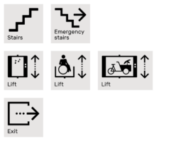
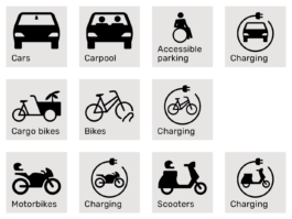
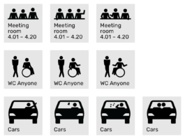
For the wayfinding system for the new headquarters of Booking.com, I was responsible for the graphic design, the pictograms and the graphic grid system holding it all together. Additionally, I worked on the wayfinding strategy and product design. The team within Mijksenaar consisted of four people.
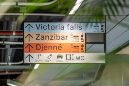
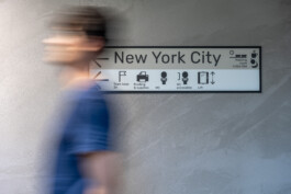
Instead of only directing the shortest route from A to B within the building, the concept of the wayfinding system was based on letting users of the building explore and wander, just as travellers do. Within the building, work areas are named after popular travel destinations, shortcuts invite to being explored.
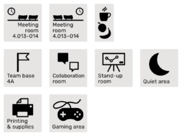
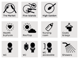
The aim is that the future occupants of this building will enjoy their workday as much as possible. The wayfinding system reflects this joy with the use of playful pictograms that have the occasional joke hidden in them.

Two grids
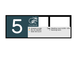
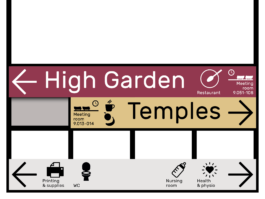
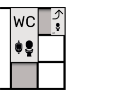
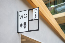
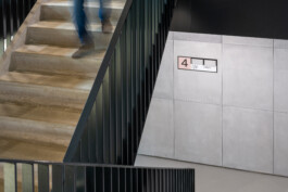
The wayfinding system uses a metal grid on which the elements containing information are placed. The amount of information determines the size of the grid element, but due to the varying contents on the signs, parts of the grid will not be filled with information. This can lead to holes to see through, or the plates at the other side of the sign can be seen, creating an ever-changing pattern. Depending on their location, elements can be flat and suspended from the ceiling, or boxy and wrapped around columns.
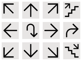
The graphics are also placed in a 10 by 10 grid, making it super easy to use for the high numbers of layouts and the almost infinite combinations needed for this project.
